pnpm and the lockfile contract
The provided pnpm toolchain — the version pinned through mise, the committed lockfile as a deterministic contract, and the guard against mixing package managers.
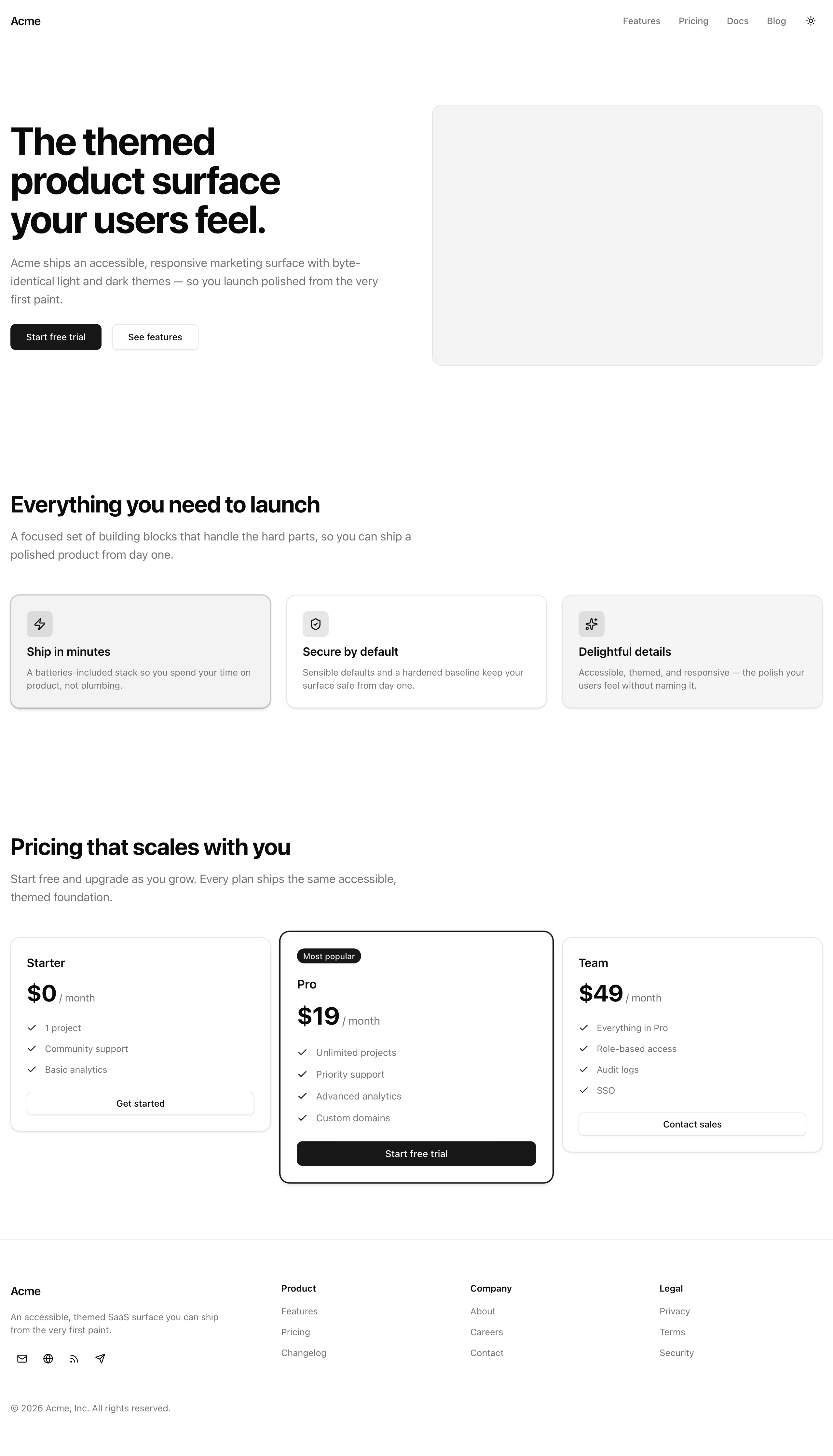
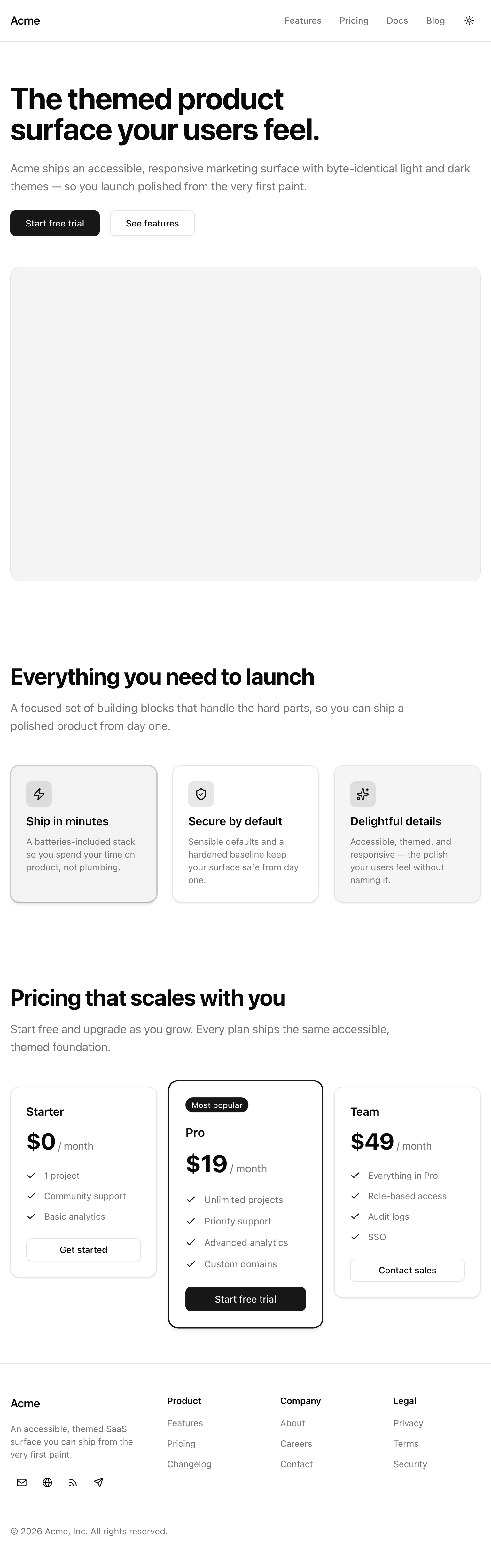
Every B2B SaaS ships the same page before anyone logs in: a header with a logo and nav, a hero with a headline and a couple of call-to-action buttons, a three-column feature grid, a pricing table, a footer, and — below the md breakpoint — a nav drawer that slides in from the side. It is the most-viewed page the company owns and the first thing a design system is judged against. That is what you are building here, and you are building it from the empty component files up.
The scope is deliberately narrow so the surface stays the focus. It is a static page: no real auth behind the “Get started” buttons, no CMS feeding the copy, no analytics, and no animation beyond what shadcn’s primitives and tw-animate-css already give you. The copy and the pricing numbers live in one typed file, src/lib/data.ts, so the components stay about layout and tokens rather than hard-coded strings. Nothing on this page talks to a server.
The reason a static page earns a whole chapter is the framing worth installing now: this is the visible bar your design system is held to. Everything the React, JSX, and Tailwind work set up — shadcn primitives, variants driven by class-variance-authority, theming through semantic tokens, responsive layout in flex and CSS Grid, a theme toggle that survives a reload without a flash, and an accessibility floor you verify rather than promise — all of it gets cashed out at once, on one page, where a single wrong token or a single keyboard trap is visible to anyone who opens it.
Three commitments run through the chapter and are not up for negotiation:
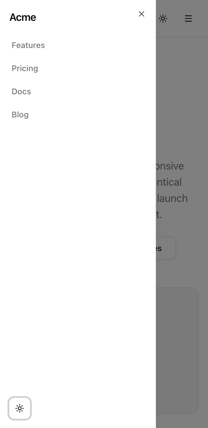
tw-animate-css and shadcn’s defaults already animate the drawer and already respect prefers-reduced-motion. You do not roll your own transitions; reaching for a hand-built animation here is a step backward, not a flourish.Sheet, plus one hook. The mobile nav is the Sheet primitive — its focus trap is the primitive’s job, not yours — and the only custom code it needs is a single project-owned hook, useLockBodyScroll. Nothing more.One more thing to set expectations. This is the from-scratch toolchain project. The starter is a Next.js 16 app that is already scaffolded and installed, but unlike every project chapter after this one, it was not cloned from a previous project’s repo — that degit-based starter flow arrives in the next unit. Because this project lays the foundation the later ones carry forward, the four lessons after this one walk through the provided toolchain — pnpm, AGENTS.md, tsconfig, and Biome — so you understand every decision in the config files before you write a line of UI.
This is where the React, JSX, and Tailwind skills stop being separate exercises and become one surface. You will compose shadcn primitives instead of styling raw elements, drive a card’s tone and emphasis from data through a cva table, theme everything through semantic tokens rather than literal colors, build the layout in flex and CSS Grid with responsive breakpoints, wire a next-themes toggle that paints the right theme on the very first frame, and hold an accessibility bar with the keyboard and Lighthouse rather than assuming you cleared it.
The other half is reading a real toolchain critically. By the end you will know why this project pins pnpm and commits its lockfile, what earns a place in an AGENTS.md and what does not, the two distinct halves of a tsconfig, and the floor a single Biome config sets for formatting and linting — all of it read off the config files the starter already ships, not configured from blank.
The shape is small because the page is static. Reading it as roles:
src/app/page.tsx. It composes the section components in order and owns the <main> landmark that wraps the three middle sections.SiteHeader, Hero, FeatureGrid, PricingTable, and SiteFooter in src/components/. SiteHeader and SiteFooter carry their own <header> and <footer> landmarks; the page supplies the <main> between them.Button, Badge, Card, Sheet, Separator, and Skeleton in src/components/ui/, imported and composed, never reinstalled.src/lib/data.ts. The nav links, feature list, pricing tiers, footer groups, and social links all live there as typed arrays.useLockBodyScroll in src/hooks/, the only piece of custom behavior the project owns.next-themes flips a .dark class on <html>; its <ThemeProvider> lives in src/app/_components/providers.tsx. The OKLCH design tokens and the @theme inline block that maps them to Tailwind utilities live in src/app/globals.css.What is not here is as telling as what is: no data fetching, no auth, no server state, no database. Every piece of complexity on this page is layout, tokens, and a single client-side interaction.
The starter is fully scaffolded. Every config file, every shadcn primitive, the global stylesheet, the layout, the page, the theme provider, and the typed data are all in place. The files you will write are the eleven highlighted ones — the section components and the one hook, each shipped as a stub with the right signature and a TODO(Ln) comment naming the lesson that fills it in. The comments below mark only the provided files a later lesson walks through or that your components import; everything left uncommented is plumbing you can take for granted.
sharp native build — next lessonlang, fonts, and the <Providers> wrappermin-h-dvh with the <main> landmark.dark) and the @theme inline mapnext-themes <ThemeProvider>cn() class-merge helperTwo structural facts worth noting so nothing surprises you later. There is no (marketing) route group — the page is src/app/page.tsx directly. And there is no standalone dialog.tsx among the primitives: the mobile drawer’s Sheet wraps Radix’s Dialog internally, so the dialog behavior is already there without a separate file.
Eleven lessons turn that empty scaffold into the running page. The first four read the toolchain; the rest build one confirmable piece of the surface each.
pnpm and the lockfile contract
The provided pnpm toolchain — the version pinned through mise, the committed lockfile as a deterministic contract, and the guard against mixing package managers.
AGENTS.md as the next contributor's briefing
What earns a place in the repo’s onboarding file — thesis, pinned stack, layout, commands, conventions pointers — and what does not.
Configuring tsconfig
The tsconfig.json read in two halves: the project-owned strictness floor and the Next.js-owned compatibility surface.
Biome, the single-binary linter and formatter
Why Biome replaces ESLint plus Prettier — the biome.json, the daily check and verify scripts, and safe versus unsafe fixes.
Site header with desktop navigation
The semantic sticky <header> with logo, desktop nav, and slots for the theme toggle and the mobile drawer.
Hero with a flicker-free theme-aware image
The single-<h1> hero with two CTAs and a light/dark image swapped purely by CSS, with no flash on load.
Feature grid with CVA card variants
A responsive three-column grid whose card tone and emphasis are chosen from data through a cva table.
Pricing table with a featured tier
A data-driven pricing row with one promoted tier and a lift that respects reduced motion.
Site footer
The footer landmark — brand block, three link-group navs, and labelled icon buttons for social links.
Flicker-free theme toggle
The next-themes sun/moon toggle with a CSS-only icon swap and no mount gate.
Mobile nav drawer
The shadcn Sheet drawer with its focus trap, the useLockBodyScroll hook, and Esc-to-close.
This project starts from the toolchain rather than from a feature, so setup is short — the starter ships scaffolded and installed, and the dev server serves the page shell as soon as it boots.
Get the starter codebase from the project repository, under Chapter 028/start/.
You already have mise from earlier in the course, where you installed it to pin Node. The starter’s .mise.toml pins both Node 24 and pnpm 11.3.0, so when you cd into the project, mise makes the right Node and pnpm versions active automatically — no global install to manage.
Install dependencies. This resolves against the committed lockfile and populates node_modules.
pnpm installStart the dev server.
pnpm devThere are no environment variables to set — the page is fully static.
When the dev server is up, open the printed local URL. The layout, the global styles, and the page frame render, but the eleven section components are still empty stubs, so the page is mostly bare scaffolding at this point. That is the expected starting state. The next four lessons explain every toolchain decision in the files you just installed, and from the lesson “Site header with desktop navigation” onward you start filling those stubs in, one confirmable piece at a time.