Mobile drawer with scroll lock
Below the md breakpoint the header’s nav links vanish and a hamburger waits in their place — and right now that hamburger does nothing.
This lesson wires it: tapping it opens a drawer that slides in from the left, holds keyboard focus inside itself, freezes the page behind it, and closes on Esc or when you tap a link — handing focus back to the hamburger on the way out.
Here is the surface this completes, the drawer open over the page at phone width.
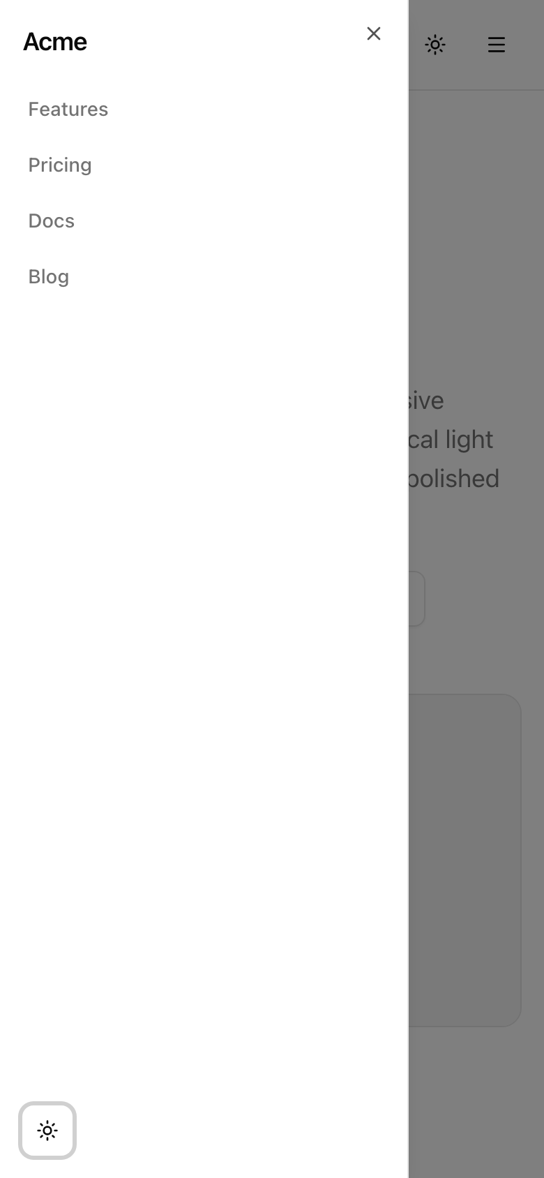
The drawer open at 390px — the same nav links the desktop header shows, plus the theme toggle, over a scroll-locked page.
That drawer is the last piece of the responsive surface. When it works, the whole page is signed off — which is why this lesson’s verification is not just the drawer’s behavior but the project’s entire standards bar.
Your mission
Section titled “Your mission”Here is the trap worth naming before you write a line: a modal surface that traps focus, dims the page, closes on Esc, and returns focus to the control that opened it is one of the most-reimplemented-and-most-broken widgets on the web.
You are not going to reimplement it.
shadcn’s Sheet is Radix’s Dialog underneath, and Radix already ships every one of those behaviors correctly — the focus trap, the overlay, Esc-to-close, and the return-focus contract are the primitive’s job, and your job is to not break them.
The one behavior the primitive does not guarantee is pinning the page behind the drawer so it can’t scroll, particularly under iOS Safari, which famously ignores a lot of scroll-locking tricks.
That one belt-and-suspenders effect is the only custom behavior this feature owns, and you’ll extract it into a hook, useLockBodyScroll.
The feature in user terms: for viewports below md, a hamburger that opens a slide-in panel carrying the same nav links the desktop header shows, plus the theme toggle.
Single-source those links from navLinks — the header already passes them to your component, so desktop and mobile stay one list and you never hand-write the link text twice.
Colors stay on the provided tokens; the cleanup in your hook must restore the prior overflow value, never blank it to '' (blanking it would clobber an outer lock some parent might hold).
Out of scope: a custom modal, any hand-rolled focus management, and nested submenus — the drawer is a flat list.
md a labelled hamburger button opens a left-side drawer; the desktop nav stays the only nav at md and up.Esc closes the drawer and returns focus to the hamburger trigger.Coding time
Section titled “Coding time”Fill src/hooks/use-lock-body-scroll.ts and src/components/mobile-nav.tsx against the brief and the tests.
The provided SiteHeader already imports MobileNav and mounts it in its md:hidden slot, so once both files are real the drawer lights up with no further wiring.
Attempt it before opening the solution below.
Reference solution and walkthrough
The hook
Section titled “The hook”The whole custom-behavior budget of this feature is sixteen lines.
import { useEffect } from 'react';
export const useLockBodyScroll = (locked: boolean): void => {  useEffect(() => {    if (!locked) {      return;    }
    const previousOverflow = document.body.style.overflow;    document.body.style.overflow = 'hidden';
    return () => {      document.body.style.overflow = previousOverflow;    };  }, [locked]);};
Two decisions carry this hook, and both are about staying out of trouble.
The first is touching document only inside useEffect.
document.body doesn’t exist when this code runs on the server, so reaching for it during render would crash the build.
Effects never run on the server and never run during render — they run on the client after paint — so putting the body mutation there is what makes the hook safe to ship in a Server-Component tree at all.
This is the cleanup-on-unmount shape from the effects work in Chapter 025: the function the effect returns runs before the next effect and on unmount, and that’s where you undo the side effect.
The second is restoring previousOverflow rather than clearing to ''.
Read the current value, stash it, set 'hidden', and on cleanup put the stashed value back.
If you instead wrote document.body.style.overflow = '' on cleanup, you’d erase any lock something else had set — picture a future where a parent already locked scroll for its own modal and your drawer’s cleanup silently un-locks it.
Restoring the captured value composes; blanking does not.
The [locked] dependency array keys the whole thing to the flag, so the lock engages the instant the drawer opens and releases the instant it closes, and at no other time.
If the useEffect-with-cleanup and the single-purpose hook shape feel familiar, they should — extracting exactly this kind of stateful side effect into a named hook is the move from the custom-hooks lesson in Chapter 026.
The drawer
Section titled “The drawer”Now the component the header already imports — four moving parts in one file.
'use client';
import { Menu } from 'lucide-react';import Link from 'next/link';import { useState } from 'react';
import { ThemeToggle } from '@/components/theme-toggle';import { Button } from '@/components/ui/button';import {  Sheet,  SheetContent,  SheetTitle,  SheetTrigger,} from '@/components/ui/sheet';import { useLockBodyScroll } from '@/hooks/use-lock-body-scroll';
export const MobileNav = ({  links,}: {  links: { href: string; label: string }[];}) => {  const [open, setOpen] = useState(false);
  useLockBodyScroll(open);
  return (    <Sheet open={open} onOpenChange={setOpen}>      <SheetTrigger asChild>        <Button          type="button"          variant="ghost"          size="icon"          data-testid="mobile-nav-trigger"          aria-label="Open menu"        >          <Menu />        </Button>      </SheetTrigger>
      <SheetContent side="left" data-testid="mobile-nav-content">        <SheetTitle className="px-4 pt-4 text-lg font-semibold tracking-tight">          Acme        </SheetTitle>
        <nav aria-label="Primary" className="flex flex-col gap-1 px-2">          {links.map((link) => (            <Link              key={link.href}              href={link.href}              onClick={() => setOpen(false)}              className="rounded-md px-3 py-2 text-sm font-medium text-muted-foreground outline-none transition-colors hover:text-foreground focus-visible:ring-[3px] focus-visible:ring-ring/50"            >              {link.label}            </Link>          ))}        </nav>
        <div className="mt-auto flex items-center gap-2 px-4 pb-4">          <ThemeToggle />        </div>      </SheetContent>    </Sheet>  );};
The state-and-lock wiring. const [open, setOpen] = useState(false) makes this a controlled Sheet: you own the open/closed boolean instead of letting the primitive track it internally. You need that because useLockBodyScroll(open) reads the same boolean — the drawer being open is exactly the condition that should freeze the page, so one piece of state drives both the panel and the scroll lock. Passing open and onOpenChange={setOpen} lets Radix flip the state on its own triggers (overlay click, Esc) while you stay the single source of truth.
'use client';
import { Menu } from 'lucide-react';import Link from 'next/link';import { useState } from 'react';
import { ThemeToggle } from '@/components/theme-toggle';import { Button } from '@/components/ui/button';import {  Sheet,  SheetContent,  SheetTitle,  SheetTrigger,} from '@/components/ui/sheet';import { useLockBodyScroll } from '@/hooks/use-lock-body-scroll';
export const MobileNav = ({  links,}: {  links: { href: string; label: string }[];}) => {  const [open, setOpen] = useState(false);
  useLockBodyScroll(open);
  return (    <Sheet open={open} onOpenChange={setOpen}>      <SheetTrigger asChild>        <Button          type="button"          variant="ghost"          size="icon"          data-testid="mobile-nav-trigger"          aria-label="Open menu"        >          <Menu />        </Button>      </SheetTrigger>
      <SheetContent side="left" data-testid="mobile-nav-content">        <SheetTitle className="px-4 pt-4 text-lg font-semibold tracking-tight">          Acme        </SheetTitle>
        <nav aria-label="Primary" className="flex flex-col gap-1 px-2">          {links.map((link) => (            <Link              key={link.href}              href={link.href}              onClick={() => setOpen(false)}              className="rounded-md px-3 py-2 text-sm font-medium text-muted-foreground outline-none transition-colors hover:text-foreground focus-visible:ring-[3px] focus-visible:ring-ring/50"            >              {link.label}            </Link>          ))}        </nav>
        <div className="mt-auto flex items-center gap-2 px-4 pb-4">          <ThemeToggle />        </div>      </SheetContent>    </Sheet>  );};
The labelled trigger. <SheetTrigger asChild> wraps a real <Button> rather than rendering its own. asChild is the Slot composition from the Button work in Chapter 022 — it hands the trigger’s behavior, and the ARIA that announces “this opens a dialog”, down onto your button, so you get one focusable, keyboard-activatable control instead of a button nested inside another. The button is icon-only, so aria-label="Open menu" is what a screen-reader user hears — without it they’d hear only “button”, the silent failure the icon-button rule in Chapter 027 exists to catch.
'use client';
import { Menu } from 'lucide-react';import Link from 'next/link';import { useState } from 'react';
import { ThemeToggle } from '@/components/theme-toggle';import { Button } from '@/components/ui/button';import {  Sheet,  SheetContent,  SheetTitle,  SheetTrigger,} from '@/components/ui/sheet';import { useLockBodyScroll } from '@/hooks/use-lock-body-scroll';
export const MobileNav = ({  links,}: {  links: { href: string; label: string }[];}) => {  const [open, setOpen] = useState(false);
  useLockBodyScroll(open);
  return (    <Sheet open={open} onOpenChange={setOpen}>      <SheetTrigger asChild>        <Button          type="button"          variant="ghost"          size="icon"          data-testid="mobile-nav-trigger"          aria-label="Open menu"        >          <Menu />        </Button>      </SheetTrigger>
      <SheetContent side="left" data-testid="mobile-nav-content">        <SheetTitle className="px-4 pt-4 text-lg font-semibold tracking-tight">          Acme        </SheetTitle>
        <nav aria-label="Primary" className="flex flex-col gap-1 px-2">          {links.map((link) => (            <Link              key={link.href}              href={link.href}              onClick={() => setOpen(false)}              className="rounded-md px-3 py-2 text-sm font-medium text-muted-foreground outline-none transition-colors hover:text-foreground focus-visible:ring-[3px] focus-visible:ring-ring/50"            >              {link.label}            </Link>          ))}        </nav>
        <div className="mt-auto flex items-center gap-2 px-4 pb-4">          <ThemeToggle />        </div>      </SheetContent>    </Sheet>  );};
The panel and its mandatory title. <SheetContent side="left"> anchors the panel to the start edge. The <SheetTitle> is not decoration — it is the dialog’s accessible name, and Radix’s Dialog logs an error if a content panel ships without one, which is the cheapest way to fail a Lighthouse a11y audit. The links come from links.map(...), the same array the desktop nav reads, so there is exactly one list of nav items in the codebase.
'use client';
import { Menu } from 'lucide-react';import Link from 'next/link';import { useState } from 'react';
import { ThemeToggle } from '@/components/theme-toggle';import { Button } from '@/components/ui/button';import {  Sheet,  SheetContent,  SheetTitle,  SheetTrigger,} from '@/components/ui/sheet';import { useLockBodyScroll } from '@/hooks/use-lock-body-scroll';
export const MobileNav = ({  links,}: {  links: { href: string; label: string }[];}) => {  const [open, setOpen] = useState(false);
  useLockBodyScroll(open);
  return (    <Sheet open={open} onOpenChange={setOpen}>      <SheetTrigger asChild>        <Button          type="button"          variant="ghost"          size="icon"          data-testid="mobile-nav-trigger"          aria-label="Open menu"        >          <Menu />        </Button>      </SheetTrigger>
      <SheetContent side="left" data-testid="mobile-nav-content">        <SheetTitle className="px-4 pt-4 text-lg font-semibold tracking-tight">          Acme        </SheetTitle>
        <nav aria-label="Primary" className="flex flex-col gap-1 px-2">          {links.map((link) => (            <Link              key={link.href}              href={link.href}              onClick={() => setOpen(false)}              className="rounded-md px-3 py-2 text-sm font-medium text-muted-foreground outline-none transition-colors hover:text-foreground focus-visible:ring-[3px] focus-visible:ring-ring/50"            >              {link.label}            </Link>          ))}        </nav>
        <div className="mt-auto flex items-center gap-2 px-4 pb-4">          <ThemeToggle />        </div>      </SheetContent>    </Sheet>  );};
Navigate-and-close, and the in-drawer toggle. Each <Link> carries both an href (so the tap navigates) and onClick={() => setOpen(false)} (so the same tap closes the drawer). Without the onClick you’d scroll to the anchor and leave a full-screen drawer covering it. The <ThemeToggle /> sits at the bottom of the panel — mt-auto pushes it down — so theming is reachable on mobile, where the header’s toggle slot is hidden.
Three things in this file are doing accessibility work the tests around requirements 5–7 don’t reach, so they’re worth calling out by name.
The aria-label on the icon-only trigger is what gives the hamburger a name.
The aria-label="Primary" on the <nav> names the navigation landmark inside the drawer.
And placing <ThemeToggle /> inside the panel is the only reason theme control is reachable below md at all, since the header’s toggle slot is md:hidden.
What you’ll notice is absent: there is no onKeyDown for Esc, no useRef to remember the trigger and refocus it on close, no overlay element, no focus-trap loop.
All of that is Radix, and the return-focus-to-trigger contract specifically is the behavior the focus lesson in Chapter 027 walked through — the primitive does it for free, and reimplementing it is how you’d introduce the bug.
The single-source-from-navLinks cut is the mobile-first responsive reflex from Chapter 021: one list, rendered twice through different visibility utilities, never duplicated as literal text.
A note on where this page goes next. In the next unit you’ll move this surface into a real App Router structure with layouts and dedicated navigation primitives. The production security headers a public marketing page needs — CSP, HSTS — come later in the course, as does the performance and Core Web Vitals pass. What this project ships is the accessibility baseline; the perf baseline is a separate audit you’ll run further on.
The component you compose here — the side prop, the SheetTrigger/SheetContent/SheetTitle anatomy, and the install command.
The primitive under the Sheet: the focus trap, Esc-to-close, and return-focus-to-trigger contract your job is to not break.
Moment of truth
Section titled “Moment of truth”This lesson closes the surface, so its check is two-staged: the lesson tests, then the whole project’s standards bar by hand.
Run the lesson suite:
pnpm test:lesson 12It exercises the four tested requirements against your two files — the trigger is a real, labelled, dialog-wired button; the links are single-sourced from links, carry an href, and close the drawer on click; the panel has a SheetTitle; and the hook sets overflow: hidden while locked, restores the prior value on cleanup, leaves scroll untouched while unlocked, and keys on [locked].
A green run reports each of those describe blocks passing.
Then run the shippability gate across the entire project:
pnpm verifyThat runs Biome in CI mode, then tsc --noEmit, then a production next build.
A clean exit means the whole surface lints, type-checks, and builds.
The lesson tests can’t reach a real focus cycle, a real Esc keypress, or a Lighthouse audit — and since this is the capstone, the by-hand pass is the project’s full standards bar, not just the drawer.
Walk each item, ticking as you go.
If one fails, the fix lives in the lesson that owns that behavior, not in ad-hoc poking.
Esc closes any open menu.md.md, Tab cycles within the open drawer and Shift+Tab reverses; focus never escapes to the page behind.Esc close — Esc closes the drawer and returns focus to the trigger.With those ticked, the surface is done.
Four calls held it together, and they’re worth restating as you sign it off.
Design tokens are the single seat of color truth — nothing on this page hard-codes a hex value, which is why the whole surface themes for free.
shadcn’s primitives ship the focus-trap and ARIA work, and the job was never to write it but to not break it.
The four discipline commitments you held from the very first component are exactly why this final audit was cheap rather than a scramble.
And useLockBodyScroll is the only custom hook this entire project owns — everything else is composition.