Pricing table with a featured tier
Ship a pricing band driven by pricingTiers where one tier reads as the obvious pick — and reduced-motion users still get a flat, calm layout.
This is the part of the page where a SaaS asks for money, so it earns three cards in a row at desktop: Starter, Pro, and Team. The middle one, Pro, is accented and nudged up a notch so your eye lands on it first. Below md the three cards stack into a single column with no horizontal scroll. Nothing here is novel JSX — the lesson is entirely about where the “this one is special” decision lives.
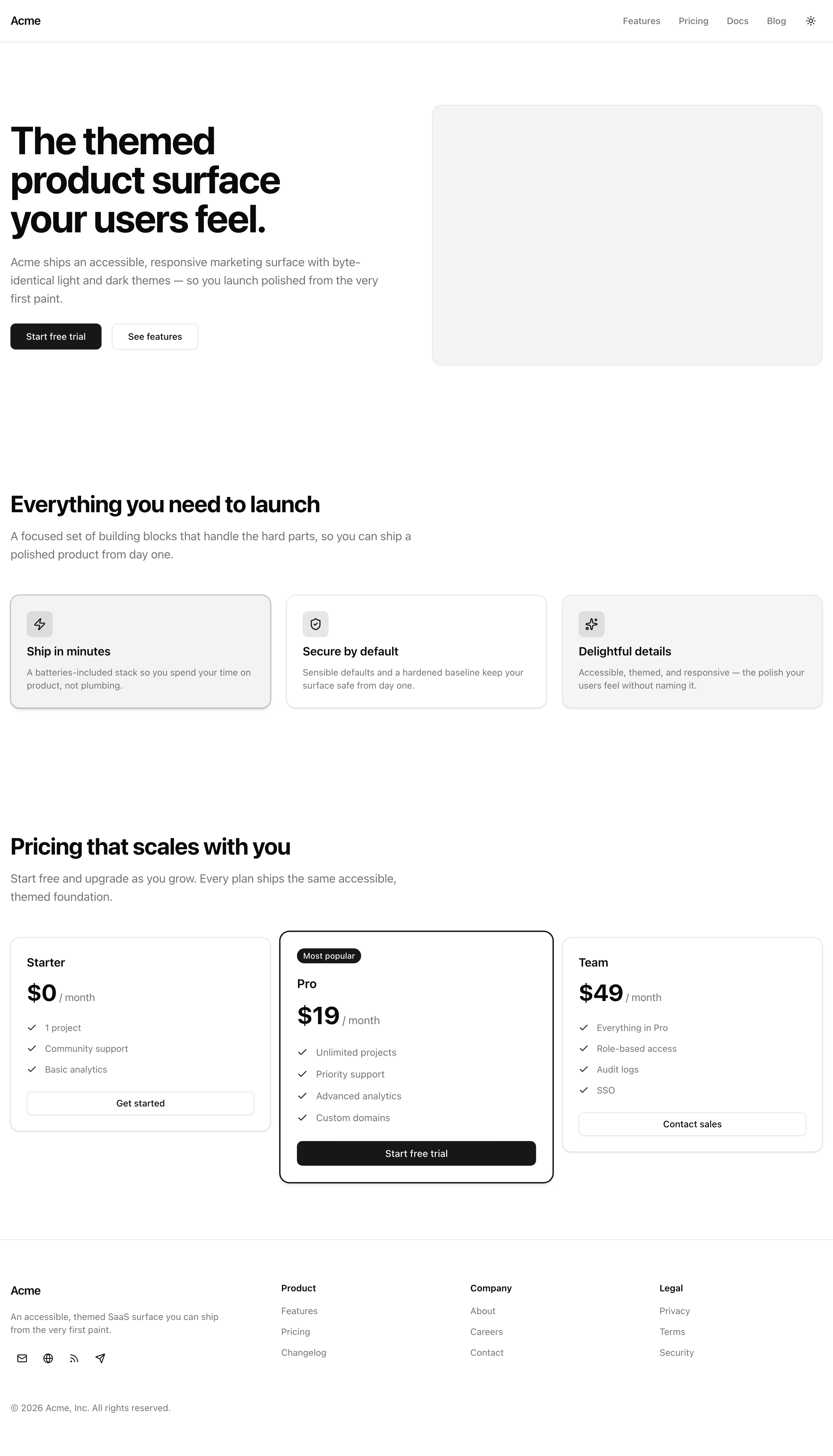
The finished pricing table at desktop width — the middle Pro tier reads as the obvious pick because a single featured flag in data.ts drives its ring, badge, and lift.
Your mission
Section titled “Your mission”Build the pricing band out of the two scaffolds waiting for you: pricing-card.tsx, which renders one tier, and pricing-table.tsx, which lays the tiers out in a responsive grid. The content already exists — pricingTiers in src/lib/data.ts is an array of three tiers, each with a name, price, period, a features list, a cta, and an optional featured flag. Your table maps over that array. You hardcode nothing per tier.
That last sentence is the whole lesson. The temptation, when one card needs to look special, is to reach into the markup and hand-decorate the Pro card: add a ring here, drop a badge there. Resist it. Treat visual emphasis as data, not markup — the single featured flag in the array is what drives the accent ring, the “Most popular” badge, and the scale lift. When a fourth tier ships next quarter, or marketing decides Team is now the popular one, someone flips a boolean in data.ts and the whole band re-promotes itself. No component gets touched. That is the difference between a pricing table you can hand off and one that becomes a liability.
Two accessibility traps live on pricing pages specifically, and you pre-empt both by construction. The first is motion: the lift that makes Pro pop is a transform, and a user who has asked their OS for reduced motion should not be served it. So the lift is gated — it only kicks in at md and up, and it flattens back out for anyone who prefers reduced motion. The second is contrast: pricing cards lean on muted gray text for the billing period and the feature list, and muted gray is exactly where pages fail their color-contrast audit. You sidestep that entirely by pulling colors only from the semantic tokens the project already ships — text-muted-foreground over bg-background clears AA on its own. Do not invent a hex value or a one-off gray; the tokens are correct, and reaching past them is how you’d break it.
Out of scope: a monthly/yearly billing toggle and real checkout. The CTAs are plain anchor links pointing at the href values in data.ts — wiring them to Stripe comes much later in the course.
pricingTiers, each showing its name, price, billing period, full feature list, and CTA.featured is visually distinct — an accent ring plus a “Most popular” badge — and no other tier is.md they stack into one column with no horizontal scroll.Coding time
Section titled “Coding time”Fill in src/components/pricing-card.tsx and src/components/pricing-table.tsx against the brief and the tests. Attempt it before opening the solution below — the whole value is in deciding, on your own, where the featured decision should live.
Reference solution and walkthrough
Start with the card. It renders one tier and knows nothing about the layout around it. Step through the four decisions that matter.
import { Check } from 'lucide-react';import Link from 'next/link';import type { ComponentProps } from 'react';
import { Badge } from '@/components/ui/badge';import { Button } from '@/components/ui/button';import { CardContent, CardFooter, CardHeader } from '@/components/ui/card';import { cn } from '@/lib/utils';
export type PricingCardProps = ComponentProps<'article'> & {  name: string;  price: string;  period: 'month' | 'year';  features: string[];  featured?: boolean;  cta: { label: string; href: string };};
export const PricingCard = ({  name,  price,  period,  features,  featured = false,  cta,  className,  ...props}: PricingCardProps) => (  <article    data-testid={featured ? 'pricing-card-featured' : 'pricing-card'}    className={cn(      'flex flex-col gap-6 rounded-xl border border-border bg-card py-6 text-card-foreground shadow-sm',      featured && 'border-primary shadow-md ring-1 ring-primary',      className,    )}    {...props}  >    <CardHeader className="gap-3">      {featured ? <Badge className="mb-1">Most popular</Badge> : null}      <h3 className="text-lg font-semibold">{name}</h3>      <p className="flex items-baseline gap-1">        <span className="text-4xl font-bold tracking-tight text-foreground">          {price}        </span>        <span className="text-muted-foreground">/ {period}</span>      </p>    </CardHeader>    <CardContent>      <ul className="flex flex-col gap-3">        {features.map((feature) => (          <li key={feature} className="flex items-center gap-3">            <Check className="size-4 text-primary" />            <span className="text-sm text-muted-foreground">{feature}</span>          </li>        ))}      </ul>    </CardContent>    <CardFooter>      <Button        asChild        className="w-full"        variant={featured ? 'default' : 'outline'}      >        <Link href={cta.href}>{cta.label}</Link>      </Button>    </CardFooter>  </article>);
The scaffold shipped PricingCardProps as a plain object; the solution intersects it with ComponentProps<'article'>, which is what lets the card accept a className and a ...props spread it forwards onto the <article>. It is the hinge of the whole design: it is precisely what lets the table hand the scale lift down to this card without the card knowing anything about it. Keep the public shape — data.ts imports PricingCardProps to type its array.
import { Check } from 'lucide-react';import Link from 'next/link';import type { ComponentProps } from 'react';
import { Badge } from '@/components/ui/badge';import { Button } from '@/components/ui/button';import { CardContent, CardFooter, CardHeader } from '@/components/ui/card';import { cn } from '@/lib/utils';
export type PricingCardProps = ComponentProps<'article'> & {  name: string;  price: string;  period: 'month' | 'year';  features: string[];  featured?: boolean;  cta: { label: string; href: string };};
export const PricingCard = ({  name,  price,  period,  features,  featured = false,  cta,  className,  ...props}: PricingCardProps) => (  <article    data-testid={featured ? 'pricing-card-featured' : 'pricing-card'}    className={cn(      'flex flex-col gap-6 rounded-xl border border-border bg-card py-6 text-card-foreground shadow-sm',      featured && 'border-primary shadow-md ring-1 ring-primary',      className,    )}    {...props}  >    <CardHeader className="gap-3">      {featured ? <Badge className="mb-1">Most popular</Badge> : null}      <h3 className="text-lg font-semibold">{name}</h3>      <p className="flex items-baseline gap-1">        <span className="text-4xl font-bold tracking-tight text-foreground">          {price}        </span>        <span className="text-muted-foreground">/ {period}</span>      </p>    </CardHeader>    <CardContent>      <ul className="flex flex-col gap-3">        {features.map((feature) => (          <li key={feature} className="flex items-center gap-3">            <Check className="size-4 text-primary" />            <span className="text-sm text-muted-foreground">{feature}</span>          </li>        ))}      </ul>    </CardContent>    <CardFooter>      <Button        asChild        className="w-full"        variant={featured ? 'default' : 'outline'}      >        <Link href={cta.href}>{cta.label}</Link>      </Button>    </CardFooter>  </article>);
One boolean fans out to three places. The data-testid flips between pricing-card and pricing-card-featured so the table’s promotion is observable; the cn() call merges in featured && 'border-primary shadow-md ring-1 ring-primary' so the accent ring appears only when the flag is set; and the badge renders only when featured, while the button switches to the solid default variant. One flag, three effects, zero per-tier markup — requirement 2 satisfied declaratively. Flip featured to another tier in data.ts and the accent, badge, and solid button move with it.
import { Check } from 'lucide-react';import Link from 'next/link';import type { ComponentProps } from 'react';
import { Badge } from '@/components/ui/badge';import { Button } from '@/components/ui/button';import { CardContent, CardFooter, CardHeader } from '@/components/ui/card';import { cn } from '@/lib/utils';
export type PricingCardProps = ComponentProps<'article'> & {  name: string;  price: string;  period: 'month' | 'year';  features: string[];  featured?: boolean;  cta: { label: string; href: string };};
export const PricingCard = ({  name,  price,  period,  features,  featured = false,  cta,  className,  ...props}: PricingCardProps) => (  <article    data-testid={featured ? 'pricing-card-featured' : 'pricing-card'}    className={cn(      'flex flex-col gap-6 rounded-xl border border-border bg-card py-6 text-card-foreground shadow-sm',      featured && 'border-primary shadow-md ring-1 ring-primary',      className,    )}    {...props}  >    <CardHeader className="gap-3">      {featured ? <Badge className="mb-1">Most popular</Badge> : null}      <h3 className="text-lg font-semibold">{name}</h3>      <p className="flex items-baseline gap-1">        <span className="text-4xl font-bold tracking-tight text-foreground">          {price}        </span>        <span className="text-muted-foreground">/ {period}</span>      </p>    </CardHeader>    <CardContent>      <ul className="flex flex-col gap-3">        {features.map((feature) => (          <li key={feature} className="flex items-center gap-3">            <Check className="size-4 text-primary" />            <span className="text-sm text-muted-foreground">{feature}</span>          </li>        ))}      </ul>    </CardContent>    <CardFooter>      <Button        asChild        className="w-full"        variant={featured ? 'default' : 'outline'}      >        <Link href={cta.href}>{cta.label}</Link>      </Button>    </CardFooter>  </article>);
This card is not wrapped in a <Card>. The <article> is the card surface — it carries the base classes by hand and composes the CardHeader / CardContent / CardFooter building blocks inside it, the same hand-composed approach from the feature card last lesson, which buys per-section spacing while keeping the <article> as the real semantic landmark. The <h3> matters too: the section opens with an <h2>, so each tier name sits one level beneath it with no skip.
import { Check } from 'lucide-react';import Link from 'next/link';import type { ComponentProps } from 'react';
import { Badge } from '@/components/ui/badge';import { Button } from '@/components/ui/button';import { CardContent, CardFooter, CardHeader } from '@/components/ui/card';import { cn } from '@/lib/utils';
export type PricingCardProps = ComponentProps<'article'> & {  name: string;  price: string;  period: 'month' | 'year';  features: string[];  featured?: boolean;  cta: { label: string; href: string };};
export const PricingCard = ({  name,  price,  period,  features,  featured = false,  cta,  className,  ...props}: PricingCardProps) => (  <article    data-testid={featured ? 'pricing-card-featured' : 'pricing-card'}    className={cn(      'flex flex-col gap-6 rounded-xl border border-border bg-card py-6 text-card-foreground shadow-sm',      featured && 'border-primary shadow-md ring-1 ring-primary',      className,    )}    {...props}  >    <CardHeader className="gap-3">      {featured ? <Badge className="mb-1">Most popular</Badge> : null}      <h3 className="text-lg font-semibold">{name}</h3>      <p className="flex items-baseline gap-1">        <span className="text-4xl font-bold tracking-tight text-foreground">          {price}        </span>        <span className="text-muted-foreground">/ {period}</span>      </p>    </CardHeader>    <CardContent>      <ul className="flex flex-col gap-3">        {features.map((feature) => (          <li key={feature} className="flex items-center gap-3">            <Check className="size-4 text-primary" />            <span className="text-sm text-muted-foreground">{feature}</span>          </li>        ))}      </ul>    </CardContent>    <CardFooter>      <Button        asChild        className="w-full"        variant={featured ? 'default' : 'outline'}      >        <Link href={cta.href}>{cta.label}</Link>      </Button>    </CardFooter>  </article>);
The CTA is a Button with asChild wrapping a Next.js <Link> — the Slot composition pattern from the Button work earlier in this unit. asChild tells the Button to render as its child instead of as a <button>, so you get button styling on a real anchor with client-side navigation. The links just point at the href strings in data.ts.
Now the table, which owns the layout and the lift.
import { PricingCard } from '@/components/pricing-card';import { pricingTiers } from '@/lib/data';
export const PricingTable = () => (  <section    id="pricing"    data-testid="pricing-table"    className="container mx-auto flex flex-col gap-12 bg-background px-4 py-16 lg:py-24"  >    <div className="flex max-w-2xl flex-col gap-4">      <h2 className="text-3xl font-bold tracking-tight text-balance text-foreground sm:text-4xl">        Pricing that scales with you      </h2>      <p className="text-lg text-pretty text-muted-foreground">        Start free and upgrade as you grow. Every plan ships the same        accessible, themed foundation.      </p>    </div>
    <div className="grid grid-cols-1 items-start gap-6 md:grid-cols-3">      {pricingTiers.map((tier) => (        <PricingCard          key={tier.name}          {...tier}          className={            tier.featured              ? 'md:scale-105 md:motion-reduce:scale-100'              : undefined          }        />      ))}    </div>  </section>);
The table maps pricingTiers straight into PricingCards, spreading {...tier} so every field flows through, keyed on tier.name. The heading block above the grid is plain prose — the <h2> that anchors the section, and a supporting paragraph in text-muted-foreground.
The grid is the reflow:
<div className="grid grid-cols-1 items-start gap-6 md:grid-cols-3">grid-cols-1 is the mobile default — one column, cards stacked, no horizontal scroll — and md:grid-cols-3 opens it into three columns at the md breakpoint and up. That is requirement 4, and it is the mobile-first reflow pattern you have been applying all unit: the small-screen layout is the base, the wider layout is the override. The items-start is deliberate and easy to miss: without it, grid items stretch to match the tallest in the row, and a scaled-up featured card would drag its siblings taller. items-start lets each card size to its own content so the lift reads as a lift, not a row-wide stretch.
Here is the decision that matters most in this file — the table, not the card, owns the lift:
className={ tier.featured ? 'md:scale-105 md:motion-reduce:scale-100' : undefined}Only the featured tier gets a className, and only the table decides that. The card stays a pure presentation of one tier — give it the same data with the flag off and it carries no lift at all. The responsive-and-motion concern is concentrated here, in the layout owner, where it belongs. This is why the card needed that ComponentProps<'article'> intersection: it is the channel this lift travels down.
Read the two utilities in that string carefully, because together they are requirement 3:
md:scale-105only applies atmdand up. Belowmdthe cards are stacked in one column, so a scale-up would just make one card wider than the rest for no reason — the lift is a desktop affordance, so it is scoped to desktop.md:motion-reduce:scale-100zeroes the scale back to 1 for any user whose system reportsprefers-reduced-motion: reduce.motion-reduce:is the Tailwind variant that targets exactly that media query — the same mechanism you met when you first learned to respect reduced motion. So a reduced-motion user at desktop sees Pro flat, accented by the ring and badge but not lifted. The promotion survives; the motion does not.
That leaves the two quieter accessibility requirements, both handled by what you didn’t do rather than what you did.
Requirement 5 — contrast — is covered because the muted price-period text and the feature labels use text-muted-foreground over the section’s bg-background. Those tokens are tuned to clear AA in both light and dark mode, so you never had to think about a contrast ratio; you just had to not reach past the tokens for a custom gray. That restraint is the implementation.
Requirement 6 — the decorative check icons — is satisfied because the lucide <Check /> renders a bare <svg> with no text node inside it, so it contributes no misleading accessible name to the feature row. The label sits in the adjacent <span>, which is the real text. The solution does not add aria-hidden to each icon.
How motion-reduce: maps to the reduced-motion media query — the variant that flattens the lift.
The media feature behind the variant, and the one DevTools emulates when you verify by hand.
Reference for the CardHeader / CardContent / CardFooter building blocks your article composes by hand.
Moment of truth
Section titled “Moment of truth”Run the lesson’s test suite:
pnpm test:lesson 9A green run means all 11 assertions pass: the table renders one card per tier with each tier’s name, price, period, features, and CTA link; exactly the data-flagged tier carries the accent ring and the “Most popular” badge; and the featured lift is present, scoped to the featured card, and paired with the reduced-motion override. Then run the full gate:
pnpm verifyThat runs Biome, the TypeScript typecheck, and the build — it must pass clean before this lesson is done.
The tests render server markup in Node, so they can confirm the classes and structure are there but they cannot see pixels, motion, or contrast. Confirm the rest by hand with pnpm dev open:
md (around 700px) and the cards stack into a single column with no horizontal scrollbar.Tick each one off as you confirm it. When the suite is green, pnpm verify is clean, and every box above is checked, your pricing band is done: promotion lives in the data, and the motion and contrast traps are closed before anyone could file them.