Feature grid with CVA card variants
The hero sells the promise; the feature band backs it up. You are going to build the three-column row that sits right under the hero — a card for each headline feature, each one styled to match a tone and an emphasis that the data file picks, not a wall of className overrides scattered through the markup. At desktop the three cards line up across the page; below the md breakpoint they stack into a single column you can scroll without ever sliding sideways.
Here is the finished band at desktop width: three cards in a row, the first one brand-tinted and lifted off the surface, the second one a plain card, the third one sitting on the muted surface. Each card carries an icon in a soft brand-colored chip, a title, and a line of copy. Shrink the viewport below md and the row reflows to one card per line. Switch your OS to dark mode and every card recolors itself — you will not write a single dark-mode rule to make that happen.
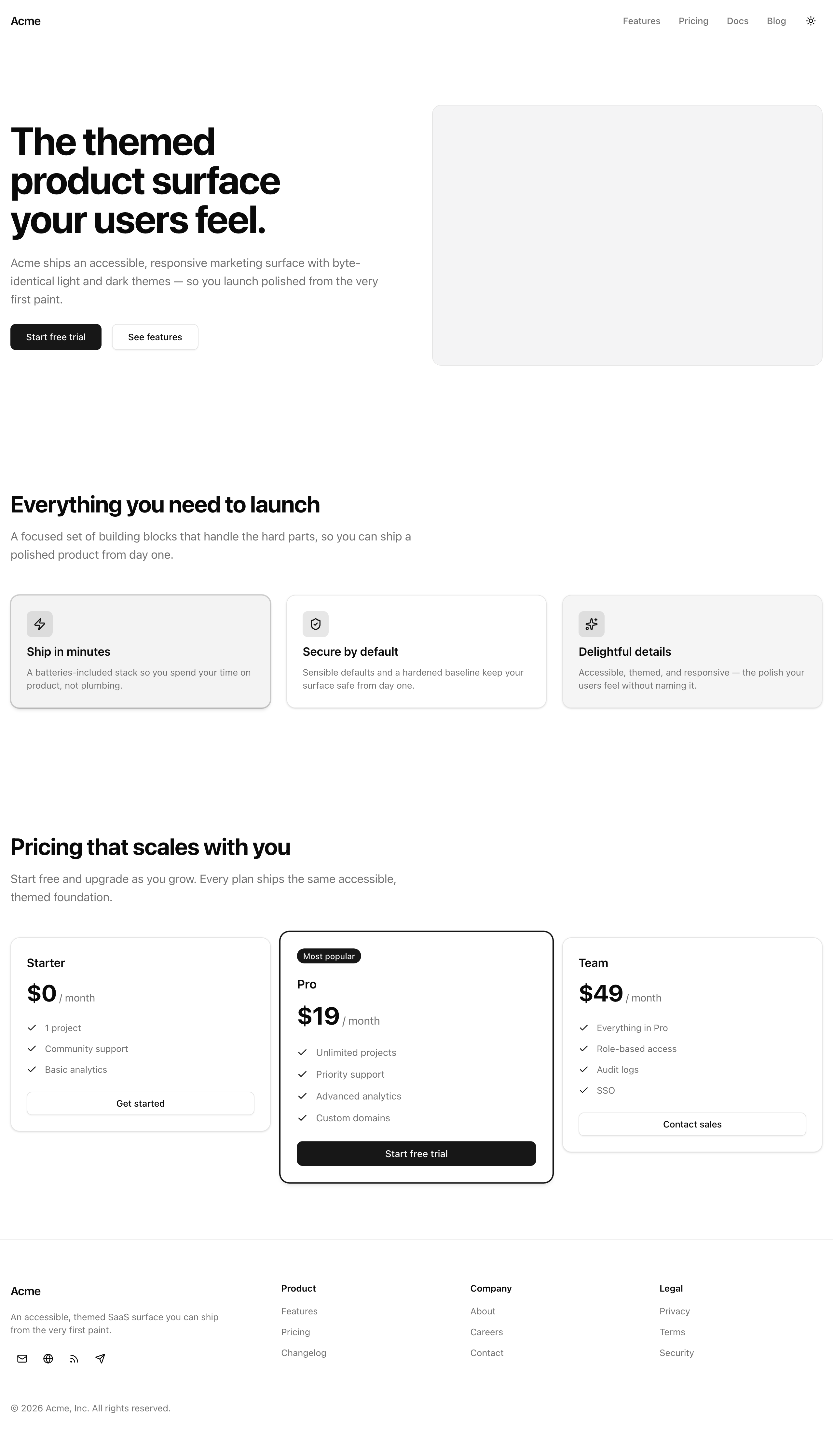
The feature band at desktop width — each card’s tone and emphasis come straight from data.ts.
Your mission
Section titled “Your mission”This is the lesson where the design-system muscle you built earlier in this unit pays for itself on a real surface. The naive way to make these cards differ is to reach for boolean props — brand, lifted, muted — and toggle classes on each one. Resist it. Three booleans describe eight combinations, but your design only has a handful of real looks; the other states are nonsense the type system would happily let a teammate ship (brand and muted at once?). Instead, give the card exactly two closed unions, tone and emphasis, and route them through one cva variant table. The table enumerates only the looks that exist, so an invalid combination is literally unrepresentable, and the data file — not the JSX — decides how each card looks. Wire the data straight to the variants by spreading each feature onto the card, and a typo in the data becomes a compile error instead of a card that renders wrong.
A few constraints keep this card honest. Every color comes from a semantic token — bg-card, bg-primary/5, bg-muted, text-card-foreground, text-primary — never a literal hex value; that is the whole reason the cards theme for free when the .dark class flips. Compose the card’s interior out of the shadcn header building blocks (CardHeader, CardTitle, CardDescription) by hand rather than dropping a whole <Card> inside — the card surface is the <article> you are styling, so nesting a second <Card> would double the border and padding. And mind the heading outline: the hero owns the page’s single <h1>, so this section’s heading must be an <h2> with no level skipped between them. Out of scope here: per-card hover or scroll motion (that discipline comes with the pricing lift next lesson), and any fourth column or carousel — three cards, one row.
features, each showing its icon, title, and description.md they collapse to one column with no horizontal scroll.<h2> with no heading-level skip from the hero’s <h1>.Coding time
Section titled “Coding time”Fill in src/components/feature-card.tsx and src/components/feature-grid.tsx against the brief above and the lesson tests. Reach for the reference solution below only after you have made your own attempt.
Reference solution and walkthrough
feature-card.tsx
Section titled “feature-card.tsx”The card splits into three parts: the variant table that defines every legal look, the props type derived from it, and the component that composes the card surface. Step through them.
import { cva, type VariantProps } from 'class-variance-authority';import type { LucideIcon } from 'lucide-react';import type { ComponentProps } from 'react';
import { CardDescription, CardHeader, CardTitle } from '@/components/ui/card';import { cn } from '@/lib/utils';
export const featureCardVariants = cva(  'flex flex-col gap-6 rounded-xl border border-border bg-card py-6 text-card-foreground shadow-sm',  {    variants: {      tone: {        default: '',        brand: 'border-primary/20 bg-primary/5',        muted: 'bg-muted',      },      emphasis: {        quiet: '',        loud: 'shadow-md ring-1 ring-primary/20',      },    },    defaultVariants: {      tone: 'default',      emphasis: 'quiet',    },  },);
export type FeatureCardProps = ComponentProps<'article'> &  VariantProps<typeof featureCardVariants> & {    title: string;    description: string;    icon: LucideIcon;  };
export const FeatureCard = ({  title,  description,  icon: Icon,  tone,  emphasis,  className,  ...props}: FeatureCardProps) => (  <article    data-testid="feature-card"    className={cn(featureCardVariants({ tone, emphasis }), className)}    {...props}  >    <CardHeader>      <span className="flex size-10 items-center justify-center rounded-md bg-primary/10 text-primary">        <Icon className="size-5" />      </span>      <CardTitle className="text-lg">{title}</CardTitle>      <CardDescription>{description}</CardDescription>    </CardHeader>  </article>);
The featureCardVariants table is the single source of truth for how a card looks. The base string carries the card surface every card shares — the rounded border, the card background and foreground tokens, the padding and shadow. Then tone and emphasis each list only their real values: default and quiet contribute nothing, brand tints the surface with --primary, muted swaps to --muted, and loud lifts the card with a stronger shadow and a faint primary ring. defaultVariants makes both optional with sane fallbacks.
import { cva, type VariantProps } from 'class-variance-authority';import type { LucideIcon } from 'lucide-react';import type { ComponentProps } from 'react';
import { CardDescription, CardHeader, CardTitle } from '@/components/ui/card';import { cn } from '@/lib/utils';
export const featureCardVariants = cva(  'flex flex-col gap-6 rounded-xl border border-border bg-card py-6 text-card-foreground shadow-sm',  {    variants: {      tone: {        default: '',        brand: 'border-primary/20 bg-primary/5',        muted: 'bg-muted',      },      emphasis: {        quiet: '',        loud: 'shadow-md ring-1 ring-primary/20',      },    },    defaultVariants: {      tone: 'default',      emphasis: 'quiet',    },  },);
export type FeatureCardProps = ComponentProps<'article'> &  VariantProps<typeof featureCardVariants> & {    title: string;    description: string;    icon: LucideIcon;  };
export const FeatureCard = ({  title,  description,  icon: Icon,  tone,  emphasis,  className,  ...props}: FeatureCardProps) => (  <article    data-testid="feature-card"    className={cn(featureCardVariants({ tone, emphasis }), className)}    {...props}  >    <CardHeader>      <span className="flex size-10 items-center justify-center rounded-md bg-primary/10 text-primary">        <Icon className="size-5" />      </span>      <CardTitle className="text-lg">{title}</CardTitle>      <CardDescription>{description}</CardDescription>    </CardHeader>  </article>);
FeatureCardProps derives its tone and emphasis types from the table itself via VariantProps, rather than re-typing the unions by hand the way the scaffold did. Add a tone to the table and the prop type updates with it — no second edit, no chance of the two drifting apart. The intersection also pulls in the native <article> attributes and the content the card needs: title, description, and an icon typed as a LucideIcon component.
import { cva, type VariantProps } from 'class-variance-authority';import type { LucideIcon } from 'lucide-react';import type { ComponentProps } from 'react';
import { CardDescription, CardHeader, CardTitle } from '@/components/ui/card';import { cn } from '@/lib/utils';
export const featureCardVariants = cva(  'flex flex-col gap-6 rounded-xl border border-border bg-card py-6 text-card-foreground shadow-sm',  {    variants: {      tone: {        default: '',        brand: 'border-primary/20 bg-primary/5',        muted: 'bg-muted',      },      emphasis: {        quiet: '',        loud: 'shadow-md ring-1 ring-primary/20',      },    },    defaultVariants: {      tone: 'default',      emphasis: 'quiet',    },  },);
export type FeatureCardProps = ComponentProps<'article'> &  VariantProps<typeof featureCardVariants> & {    title: string;    description: string;    icon: LucideIcon;  };
export const FeatureCard = ({  title,  description,  icon: Icon,  tone,  emphasis,  className,  ...props}: FeatureCardProps) => (  <article    data-testid="feature-card"    className={cn(featureCardVariants({ tone, emphasis }), className)}    {...props}  >    <CardHeader>      <span className="flex size-10 items-center justify-center rounded-md bg-primary/10 text-primary">        <Icon className="size-5" />      </span>      <CardTitle className="text-lg">{title}</CardTitle>      <CardDescription>{description}</CardDescription>    </CardHeader>  </article>);
The component is an <article> — the card surface itself. cn() merges the variant classes with any className the caller passes, last-wins on conflicts. Inside, a CardHeader holds a token-backed icon chip (bg-primary/10 text-primary), the title, and the description. Note the icon is rendered from the Icon component the data passed in — the card never imports a specific icon, so it stays content-agnostic.
feature-grid.tsx
Section titled “feature-grid.tsx”The grid is the easy half: an introductory heading block and a responsive grid that maps the data onto cards.
import { FeatureCard } from '@/components/feature-card';import { features } from '@/lib/data';
export const FeatureGrid = () => (  <section    id="features"    data-testid="feature-grid"    className="container mx-auto flex flex-col gap-12 px-4 py-16 lg:py-24"  >    <div className="flex max-w-2xl flex-col gap-4">      <h2 className="text-3xl font-bold tracking-tight text-balance text-foreground sm:text-4xl">        Everything you need to launch      </h2>      <p className="text-lg text-pretty text-muted-foreground">        A focused set of building blocks that handle the hard parts, so you can        ship a polished product from day one.      </p>    </div>
    <div className="grid grid-cols-1 gap-6 md:grid-cols-3">      {features.map((feature) => (        <FeatureCard key={feature.title} {...feature} />      ))}    </div>  </section>);
Why this shape
Section titled “Why this shape”One tone union and one emphasis union beat three booleans. With N boolean flags the type permits 2^N combinations, most of which your design never has — and nothing stops a teammate from passing two contradictory ones. A cva table enumerates only the real states, so the impossible ones simply have no name. That is what lets the spread {...feature} wire the data straight into the variants safely, and it is exactly what makes requirement 2’s “no invalid combination expressible” true rather than aspirational.
VariantProps<typeof featureCardVariants> instead of hand-written unions. The scaffold typed tone? and emphasis? by hand, which means the variant table and the prop type are two copies of the same truth waiting to disagree. Deriving the props from the table makes the table the single source — add a tone there and the prop type follows automatically. The CVA-plus-VariantProps mechanics, and the last-wins merge order of cn(), were taught in the components-and-composition chapter; this lesson just applies them.
Compose the header sub-parts, not a whole <Card>. The base cva string already paints the card surface onto the <article>. Wrapping a shadcn <Card> inside would stack a second bordered, padded box on top of the first. Reaching for CardHeader, CardTitle, and CardDescription instead gives you the internal rhythm — the spacing and the muted description color — without that second box.
A few of the requirements have no automated test, so they live in the code itself. The card’s colors are token utilities top to bottom (bg-card, bg-primary/5, bg-muted, text-card-foreground, text-primary), which is why theme switching is automatic and free — the same recoloring mechanism you saw with the .dark class earlier in this unit, no per-card dark rule required. The grid is grid-cols-1 md:grid-cols-3, the responsive-columns pattern from the layout chapter, so it collapses to one column below md. Naming follows the house style — featureCardVariants mirrors the buttonVariants convention in the shadcn button — and key={feature.title} is a stable, content-derived key rather than an array index. The <h2> lives in this section, one clean level below the hero’s <h1>, so the heading outline never skips.
The official guide to the variant table, defaultVariants, and VariantProps you wire into the card.
Reference for the CardHeader, CardTitle, and CardDescription sub-parts you compose by hand.
Moment of truth
Section titled “Moment of truth”Run the lesson suite:
pnpm test:lesson 8A green run looks like this — six passing assertions across the two requirement groups:
 ✓ tests/lessons/Lesson 8.test.ts (6 tests)   ✓ Lesson 8 — Feature grid with CVA card variants     ✓ renders one data-driven card per feature, with icon/title/copy       ✓ renders exactly one card per entry in features       ✓ shows each feature's title and description text       ✓ renders an icon (an <svg>) inside every card     ✓ applies each card's tone and emphasis from the data, with no invalid state expressible       ✓ recolors each card to match its data-driven tone       ✓ lifts each card according to its data-driven emphasis       ✓ enumerates only real tones — an unknown tone yields no foreign tone classes
 Test Files  1 passed (1)      Tests  6 passed (6)
Then run the full gate to confirm Biome, the typecheck, and the production build are all happy:
pnpm verifyThe tests render the grid’s first-paint HTML in a Node environment, so they can see the card count, the rendered text, the icons, and the per-card tone and emphasis classes — but they cannot see layout, the heading outline, or live theming. Confirm those three by hand in the browser with pnpm dev:
md and they collapse to one column with no horizontal scrollbar.<h1> followed directly by this section’s <h2>, with no level skipped.