Site footer
The header, hero, feature grid, and pricing table are all in place; the page ends on an empty band sitting at the bottom of your min-h-dvh column.
In this lesson you ship the footer that fills it — three link columns, the brand, a copyright line, and a row of social icon buttons that work for screen-reader and keyboard users just as well as they do for everyone else.
A footer is trivial markup, and that is exactly the trap. The interesting part is the row of icon-only social buttons. An icon with no text is invisible to a screen reader, so each one has to carry its own accessible name or it ships as a silent dead end. Get the labelling and the column reflow right by default here, and this surface clears the project’s accessibility bar with no remediation pass.
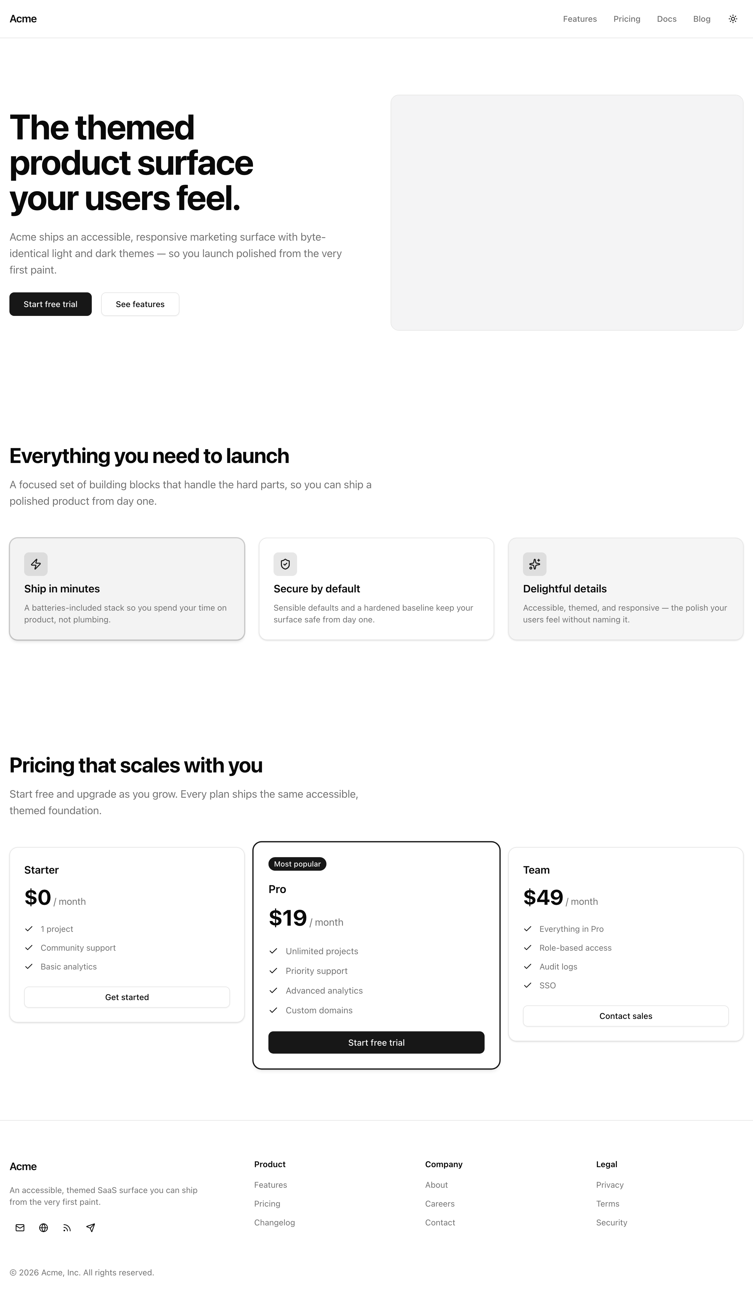
The finished footer at desktop width: the brand block sits left of three link columns, with the social buttons under the blurb.
At desktop the brand block sits to the left of three link columns.
Below md everything stacks into a single column with no horizontal scroll.
Tabbing reaches every link and social button in order, each with a visible focus ring, and each social icon button announces where it goes the moment a screen reader lands on it.
Your mission
Section titled “Your mission”Build the footer band for the page.
It carries three link-group columns — Product, Company, and Legal — a brand block with the “Acme” wordmark and a one-line blurb, a copyright line, and a row of social icon buttons.
The columns and the social row are driven entirely by footerGroups and socialLinks, the two typed arrays already exported from src/lib/data.ts, so you map over the data rather than hand-placing any column or button.
Lead with the part that earns this lesson its place: an unlabelled icon button is the exact silent failure the project’s accessibility bar exists to catch. The footer looks simple, but it is where icon-only controls and column reflow both have to be done right, because nothing downstream will catch them for you. Each social button shows a single lucide glyph and no text — so each one needs an accessible name of its own, and the glyph itself must stay decorative so it doesn’t compete with that name. You met this exact pattern in the chapter on shadcn and the accessibility baseline, in the lesson “No ARIA is better than bad ARIA”; this is where you apply it.
Keep the layout data-driven, keep your colors on the semantic tokens the project already defines — text-foreground, text-muted-foreground, border-border, bg-background — and never reach for a literal color value.
The whole band is one <footer> landmark; the link columns inside it are <nav> landmarks, not nested footers.
A newsletter signup form and any locale or currency switcher are out of scope here — this is a static footer.
<footer> landmark.md they stack into one column with no horizontal scroll.Coding time
Section titled “Coding time”Open src/components/site-footer.tsx — it is the start/ scaffold, an empty <footer data-testid="site-footer" />.
Build it against the brief above and the lesson’s tests, then open the walkthrough below to compare.
Reference solution and walkthrough
The whole component is one file. Read it part by part — the imports, the band wrapper and its grid, the brand block, the link columns, and the copyright line.
import Link from 'next/link';
import { Button } from '@/components/ui/button';import { footerGroups, socialLinks } from '@/lib/data';
export const SiteFooter = () => (  <footer    data-testid="site-footer"    className="border-t border-border bg-background"  >    <div className="container mx-auto flex flex-col gap-12 px-4 py-12 lg:py-16">      <div className="grid grid-cols-1 gap-10 md:grid-cols-[1.5fr_repeat(3,1fr)]">        <div className="flex flex-col items-start gap-4">          <Link            href="/"            className="rounded-md text-lg font-semibold tracking-tight text-foreground outline-none focus-visible:ring-[3px] focus-visible:ring-ring/50"          >            Acme          </Link>          <p className="max-w-xs text-sm text-pretty text-muted-foreground">            An accessible, themed SaaS surface you can ship from the very first            paint.          </p>          <div className="flex items-center gap-1">            {socialLinks.map((link) => (              <Button key={link.href} asChild size="icon" variant="ghost">                <a aria-label={link.label} href={link.href}>                  <link.icon />                </a>              </Button>            ))}          </div>        </div>
        {footerGroups.map((group) => (          <nav            key={group.heading}            aria-label={group.heading}            className="flex flex-col gap-3"          >            <h2 className="text-sm font-semibold text-foreground">              {group.heading}            </h2>            <ul className="flex flex-col gap-2">              {group.links.map((link) => (                <li key={link.href}>                  <Link                    href={link.href}                    className="rounded-md text-sm text-muted-foreground outline-none transition-colors hover:text-foreground focus-visible:ring-[3px] focus-visible:ring-ring/50"                  >                    {link.label}                  </Link>                </li>              ))}            </ul>          </nav>        ))}      </div>
      <p className="text-sm text-muted-foreground">        © 2026 Acme, Inc. All rights reserved.      </p>    </div>  </footer>);
Four imports. Link is Next’s client-side link; Button is the shadcn primitive you have used all chapter; footerGroups and socialLinks are the typed arrays from @/lib/data that drive the columns and the social row. There is no logo import — the brand is a text wordmark, not an image.
import Link from 'next/link';
import { Button } from '@/components/ui/button';import { footerGroups, socialLinks } from '@/lib/data';
export const SiteFooter = () => (  <footer    data-testid="site-footer"    className="border-t border-border bg-background"  >    <div className="container mx-auto flex flex-col gap-12 px-4 py-12 lg:py-16">      <div className="grid grid-cols-1 gap-10 md:grid-cols-[1.5fr_repeat(3,1fr)]">        <div className="flex flex-col items-start gap-4">          <Link            href="/"            className="rounded-md text-lg font-semibold tracking-tight text-foreground outline-none focus-visible:ring-[3px] focus-visible:ring-ring/50"          >            Acme          </Link>          <p className="max-w-xs text-sm text-pretty text-muted-foreground">            An accessible, themed SaaS surface you can ship from the very first            paint.          </p>          <div className="flex items-center gap-1">            {socialLinks.map((link) => (              <Button key={link.href} asChild size="icon" variant="ghost">                <a aria-label={link.label} href={link.href}>                  <link.icon />                </a>              </Button>            ))}          </div>        </div>
        {footerGroups.map((group) => (          <nav            key={group.heading}            aria-label={group.heading}            className="flex flex-col gap-3"          >            <h2 className="text-sm font-semibold text-foreground">              {group.heading}            </h2>            <ul className="flex flex-col gap-2">              {group.links.map((link) => (                <li key={link.href}>                  <Link                    href={link.href}                    className="rounded-md text-sm text-muted-foreground outline-none transition-colors hover:text-foreground focus-visible:ring-[3px] focus-visible:ring-ring/50"                  >                    {link.label}                  </Link>                </li>              ))}            </ul>          </nav>        ))}      </div>
      <p className="text-sm text-muted-foreground">        © 2026 Acme, Inc. All rights reserved.      </p>    </div>  </footer>);
The single <footer> landmark — the one contentinfo for the page. border-t border-border draws the top rule that separates it from the pricing table above; bg-background and the inner container mx-auto px-4 keep it on the page’s tokens and inside the gutter, so it never overflows the viewport.
import Link from 'next/link';
import { Button } from '@/components/ui/button';import { footerGroups, socialLinks } from '@/lib/data';
export const SiteFooter = () => (  <footer    data-testid="site-footer"    className="border-t border-border bg-background"  >    <div className="container mx-auto flex flex-col gap-12 px-4 py-12 lg:py-16">      <div className="grid grid-cols-1 gap-10 md:grid-cols-[1.5fr_repeat(3,1fr)]">        <div className="flex flex-col items-start gap-4">          <Link            href="/"            className="rounded-md text-lg font-semibold tracking-tight text-foreground outline-none focus-visible:ring-[3px] focus-visible:ring-ring/50"          >            Acme          </Link>          <p className="max-w-xs text-sm text-pretty text-muted-foreground">            An accessible, themed SaaS surface you can ship from the very first            paint.          </p>          <div className="flex items-center gap-1">            {socialLinks.map((link) => (              <Button key={link.href} asChild size="icon" variant="ghost">                <a aria-label={link.label} href={link.href}>                  <link.icon />                </a>              </Button>            ))}          </div>        </div>
        {footerGroups.map((group) => (          <nav            key={group.heading}            aria-label={group.heading}            className="flex flex-col gap-3"          >            <h2 className="text-sm font-semibold text-foreground">              {group.heading}            </h2>            <ul className="flex flex-col gap-2">              {group.links.map((link) => (                <li key={link.href}>                  <Link                    href={link.href}                    className="rounded-md text-sm text-muted-foreground outline-none transition-colors hover:text-foreground focus-visible:ring-[3px] focus-visible:ring-ring/50"                  >                    {link.label}                  </Link>                </li>              ))}            </ul>          </nav>        ))}      </div>
      <p className="text-sm text-muted-foreground">        © 2026 Acme, Inc. All rights reserved.      </p>    </div>  </footer>);
The whole reflow lives in this one line. grid-cols-1 is the mobile stack — every child on its own row. At md and up, the template becomes four tracks: a wider 1.5fr for the brand block and three equal 1fr tracks for the link columns. One grid, no separate flex wrapper, no max-width hack.
import Link from 'next/link';
import { Button } from '@/components/ui/button';import { footerGroups, socialLinks } from '@/lib/data';
export const SiteFooter = () => (  <footer    data-testid="site-footer"    className="border-t border-border bg-background"  >    <div className="container mx-auto flex flex-col gap-12 px-4 py-12 lg:py-16">      <div className="grid grid-cols-1 gap-10 md:grid-cols-[1.5fr_repeat(3,1fr)]">        <div className="flex flex-col items-start gap-4">          <Link            href="/"            className="rounded-md text-lg font-semibold tracking-tight text-foreground outline-none focus-visible:ring-[3px] focus-visible:ring-ring/50"          >            Acme          </Link>          <p className="max-w-xs text-sm text-pretty text-muted-foreground">            An accessible, themed SaaS surface you can ship from the very first            paint.          </p>          <div className="flex items-center gap-1">            {socialLinks.map((link) => (              <Button key={link.href} asChild size="icon" variant="ghost">                <a aria-label={link.label} href={link.href}>                  <link.icon />                </a>              </Button>            ))}          </div>        </div>
        {footerGroups.map((group) => (          <nav            key={group.heading}            aria-label={group.heading}            className="flex flex-col gap-3"          >            <h2 className="text-sm font-semibold text-foreground">              {group.heading}            </h2>            <ul className="flex flex-col gap-2">              {group.links.map((link) => (                <li key={link.href}>                  <Link                    href={link.href}                    className="rounded-md text-sm text-muted-foreground outline-none transition-colors hover:text-foreground focus-visible:ring-[3px] focus-visible:ring-ring/50"                  >                    {link.label}                  </Link>                </li>              ))}            </ul>          </nav>        ))}      </div>
      <p className="text-sm text-muted-foreground">        © 2026 Acme, Inc. All rights reserved.      </p>    </div>  </footer>);
The brand wordmark — a Link to / reading “Acme”, not an <img>. It carries outline-none focus-visible:ring-[3px] focus-visible:ring-ring/50: no default browser outline, but a clear ring the moment it is focused by keyboard. Every link in this footer carries that same focus treatment.
import Link from 'next/link';
import { Button } from '@/components/ui/button';import { footerGroups, socialLinks } from '@/lib/data';
export const SiteFooter = () => (  <footer    data-testid="site-footer"    className="border-t border-border bg-background"  >    <div className="container mx-auto flex flex-col gap-12 px-4 py-12 lg:py-16">      <div className="grid grid-cols-1 gap-10 md:grid-cols-[1.5fr_repeat(3,1fr)]">        <div className="flex flex-col items-start gap-4">          <Link            href="/"            className="rounded-md text-lg font-semibold tracking-tight text-foreground outline-none focus-visible:ring-[3px] focus-visible:ring-ring/50"          >            Acme          </Link>          <p className="max-w-xs text-sm text-pretty text-muted-foreground">            An accessible, themed SaaS surface you can ship from the very first            paint.          </p>          <div className="flex items-center gap-1">            {socialLinks.map((link) => (              <Button key={link.href} asChild size="icon" variant="ghost">                <a aria-label={link.label} href={link.href}>                  <link.icon />                </a>              </Button>            ))}          </div>        </div>
        {footerGroups.map((group) => (          <nav            key={group.heading}            aria-label={group.heading}            className="flex flex-col gap-3"          >            <h2 className="text-sm font-semibold text-foreground">              {group.heading}            </h2>            <ul className="flex flex-col gap-2">              {group.links.map((link) => (                <li key={link.href}>                  <Link                    href={link.href}                    className="rounded-md text-sm text-muted-foreground outline-none transition-colors hover:text-foreground focus-visible:ring-[3px] focus-visible:ring-ring/50"                  >                    {link.label}                  </Link>                </li>              ))}            </ul>          </nav>        ))}      </div>
      <p className="text-sm text-muted-foreground">        © 2026 Acme, Inc. All rights reserved.      </p>    </div>  </footer>);
The social row, mapped from socialLinks. This is the lesson’s hinge. <Button asChild> renders no <button> of its own — it merges its props onto the child via Radix’s Slot, so the real element is the <a>. That is why the aria-label and the href live on the <a>, not on Button. The lucide <link.icon /> is decorative and contributes no text, so that label is the control’s only accessible name.
import Link from 'next/link';
import { Button } from '@/components/ui/button';import { footerGroups, socialLinks } from '@/lib/data';
export const SiteFooter = () => (  <footer    data-testid="site-footer"    className="border-t border-border bg-background"  >    <div className="container mx-auto flex flex-col gap-12 px-4 py-12 lg:py-16">      <div className="grid grid-cols-1 gap-10 md:grid-cols-[1.5fr_repeat(3,1fr)]">        <div className="flex flex-col items-start gap-4">          <Link            href="/"            className="rounded-md text-lg font-semibold tracking-tight text-foreground outline-none focus-visible:ring-[3px] focus-visible:ring-ring/50"          >            Acme          </Link>          <p className="max-w-xs text-sm text-pretty text-muted-foreground">            An accessible, themed SaaS surface you can ship from the very first            paint.          </p>          <div className="flex items-center gap-1">            {socialLinks.map((link) => (              <Button key={link.href} asChild size="icon" variant="ghost">                <a aria-label={link.label} href={link.href}>                  <link.icon />                </a>              </Button>            ))}          </div>        </div>
        {footerGroups.map((group) => (          <nav            key={group.heading}            aria-label={group.heading}            className="flex flex-col gap-3"          >            <h2 className="text-sm font-semibold text-foreground">              {group.heading}            </h2>            <ul className="flex flex-col gap-2">              {group.links.map((link) => (                <li key={link.href}>                  <Link                    href={link.href}                    className="rounded-md text-sm text-muted-foreground outline-none transition-colors hover:text-foreground focus-visible:ring-[3px] focus-visible:ring-ring/50"                  >                    {link.label}                  </Link>                </li>              ))}            </ul>          </nav>        ))}      </div>
      <p className="text-sm text-muted-foreground">        © 2026 Acme, Inc. All rights reserved.      </p>    </div>  </footer>);
Each link group is its own <nav> landmark, labelled with aria-label={group.heading}. Now assistive tech can enumerate the page’s navigation regions by name — “Product”, “Company”, “Legal” — instead of finding three anonymous lists. The aria-label reuses the heading text, so the name has a single source.
import Link from 'next/link';
import { Button } from '@/components/ui/button';import { footerGroups, socialLinks } from '@/lib/data';
export const SiteFooter = () => (  <footer    data-testid="site-footer"    className="border-t border-border bg-background"  >    <div className="container mx-auto flex flex-col gap-12 px-4 py-12 lg:py-16">      <div className="grid grid-cols-1 gap-10 md:grid-cols-[1.5fr_repeat(3,1fr)]">        <div className="flex flex-col items-start gap-4">          <Link            href="/"            className="rounded-md text-lg font-semibold tracking-tight text-foreground outline-none focus-visible:ring-[3px] focus-visible:ring-ring/50"          >            Acme          </Link>          <p className="max-w-xs text-sm text-pretty text-muted-foreground">            An accessible, themed SaaS surface you can ship from the very first            paint.          </p>          <div className="flex items-center gap-1">            {socialLinks.map((link) => (              <Button key={link.href} asChild size="icon" variant="ghost">                <a aria-label={link.label} href={link.href}>                  <link.icon />                </a>              </Button>            ))}          </div>        </div>
        {footerGroups.map((group) => (          <nav            key={group.heading}            aria-label={group.heading}            className="flex flex-col gap-3"          >            <h2 className="text-sm font-semibold text-foreground">              {group.heading}            </h2>            <ul className="flex flex-col gap-2">              {group.links.map((link) => (                <li key={link.href}>                  <Link                    href={link.href}                    className="rounded-md text-sm text-muted-foreground outline-none transition-colors hover:text-foreground focus-visible:ring-[3px] focus-visible:ring-ring/50"                  >                    {link.label}                  </Link>                </li>              ))}            </ul>          </nav>        ))}      </div>
      <p className="text-sm text-muted-foreground">        © 2026 Acme, Inc. All rights reserved.      </p>    </div>  </footer>);
Inside each nav, a <ul> of links mapped from group.links. Links rest at text-muted-foreground and lift to text-foreground on hover via transition-colors — a quiet, token-only hover, and the same focus-visible ring as the wordmark for keyboard users.
import Link from 'next/link';
import { Button } from '@/components/ui/button';import { footerGroups, socialLinks } from '@/lib/data';
export const SiteFooter = () => (  <footer    data-testid="site-footer"    className="border-t border-border bg-background"  >    <div className="container mx-auto flex flex-col gap-12 px-4 py-12 lg:py-16">      <div className="grid grid-cols-1 gap-10 md:grid-cols-[1.5fr_repeat(3,1fr)]">        <div className="flex flex-col items-start gap-4">          <Link            href="/"            className="rounded-md text-lg font-semibold tracking-tight text-foreground outline-none focus-visible:ring-[3px] focus-visible:ring-ring/50"          >            Acme          </Link>          <p className="max-w-xs text-sm text-pretty text-muted-foreground">            An accessible, themed SaaS surface you can ship from the very first            paint.          </p>          <div className="flex items-center gap-1">            {socialLinks.map((link) => (              <Button key={link.href} asChild size="icon" variant="ghost">                <a aria-label={link.label} href={link.href}>                  <link.icon />                </a>              </Button>            ))}          </div>        </div>
        {footerGroups.map((group) => (          <nav            key={group.heading}            aria-label={group.heading}            className="flex flex-col gap-3"          >            <h2 className="text-sm font-semibold text-foreground">              {group.heading}            </h2>            <ul className="flex flex-col gap-2">              {group.links.map((link) => (                <li key={link.href}>                  <Link                    href={link.href}                    className="rounded-md text-sm text-muted-foreground outline-none transition-colors hover:text-foreground focus-visible:ring-[3px] focus-visible:ring-ring/50"                  >                    {link.label}                  </Link>                </li>              ))}            </ul>          </nav>        ))}      </div>
      <p className="text-sm text-muted-foreground">        © 2026 Acme, Inc. All rights reserved.      </p>    </div>  </footer>);
The copyright line — a plain <p> on text-muted-foreground. It sits outside the grid, so it always spans the full width beneath the columns at every breakpoint.
A few decisions worth pausing on.
Where the accessible name lives under asChild.
<Button asChild> is the single most common place inexperienced devs put an aria-label on the wrong element.
Because Slot merges the button’s props down onto the child <a> and renders no <button>, the label and the href belong on that <a>.
Put the aria-label on Button instead and it lands nowhere useful.
This is the icon-only button pattern from “No ARIA is better than bad ARIA” — refer back to it rather than re-deriving it here.
One <nav> per group.
Each column is a labelled navigation landmark in its own right, which is what lets a screen-reader user jump straight to “Legal” by name.
Reusing group.heading as the aria-label keeps the visible heading and the accessible name in sync from one string.
Why md:grid-cols-[1.5fr_repeat(3,1fr)] and not four equal columns.
The brand block — wordmark, blurb, and social row — needs more horizontal room than a single link list.
The arbitrary-value grid template expresses “one wide track, three equal ones” directly, and because the same grid drops to grid-cols-1 below md, the stack comes for free.
You set the responsive cut in one place; the breakpoint reflex itself is the one you built in “Breakpoints and the mobile-first reflex”.
On the two requirements the tests can’t reach:
- The reflow is entirely the grid:
grid-cols-1stacks,md:grid-cols-[…]lays out the row, andcontainer mx-auto px-4keeps everything inside the gutter so there is never horizontal scroll. - The focus rings and tab order come straight from the markup. Every footer
Linkcarriesoutline-none focus-visible:ring-[3px] focus-visible:ring-ring/50, and the social buttons inherit the shadcnButtonfocus ring. Tab order is document order — the brand block and its social row come first, then the three nav columns left to right.
One thing that looks wrong at a glance but isn’t: the footer group headings are <h2>, the same level as the page’s section headings.
That is fine here because each <h2> sits inside a labelled <nav> landmark, which scopes it — the page still has exactly one <h1>, in the hero, and no level is skipped on the way down.
Do not bump these to <h3> to “fix” a hierarchy that isn’t broken.
MDN's reference, with the exact icon-only button pattern your social row uses.
shadcn's Button docs, including the asChild prop that renders your <a> in place of a <button>.
Why one body-level <footer> maps to the contentinfo landmark, and why footers don't nest.
Moment of truth
Section titled “Moment of truth”Run the lesson’s test suite:
pnpm test:lesson 10The suite renders the footer’s first-paint markup and checks observable output only — the wordmark and copyright text, every group heading and link, every social control’s accessible name and href, the decorative glyph inside each one, and that exactly one <footer> landmark exists.
On success you get a green Vitest summary:
 ✓ tests/lessons/Lesson 10.test.ts (8 tests)   ✓ Lesson 10 — Site footer     ✓ renders the link groups, the brand wordmark, and the copyright line       ✓ shows the "Acme" brand wordmark       ✓ renders every footer group heading from footerGroups       ✓ renders every link label and href from footerGroups       ✓ shows the copyright line     ✓ labels every social icon button and hides the decorative glyph       ✓ renders one labelled social control per entry in socialLinks       ✓ uses each link's label as the control's accessible name and links to its href       ✓ keeps the lucide glyph decorative so it adds no competing accessible name     ✓ exposes exactly one footer landmark       ✓ renders exactly one <footer> contentinfo landmark
 Test Files  1 passed (1)      Tests  8 passed (8)
The tests run in a Node environment with no DOM and no prefers-color-scheme, so the two requirements that depend on a real viewport — the layout reflow and keyboard traversal — are yours to confirm.
Run pnpm dev, open the page, and walk this list:
md and they collapse into a single column with no horizontal scrollbar.